Red Herring Jeff
Icon, letterhead, and personal branding
jnjohnson@redherringillustration was my first “professional” email. I was figuring out my identity and voice still, and while the internet was still very young, there were already Jeffrey Johnson Artist google hits that weren’t me. I was trying to stand out. Maybe I was trying too hard in one direction.
One of the challenges that we all face as we begin the transition from student artist to professional is the discovery in branding ourselves that as our first clients, we’re also our worst clients. This is usually a result of simply not knowing what our priorities as a designer are. What our voice sounds like. So we say what clients have said to artists since the pope hired Michelangelo to paint that chapel ceiling. I don’t know what I want, but I’ll know it when I see it.
This directive is hard enough when someone is paying you for the right to say that your ideas aren’t quite what they’re looking for. At least they can’t tell you they don’t like it before you’ve even had a chance to explore it, though. Clients will push us to try things that we thought we weren’t interested in or capable of. Clients will make us try things that we’re certain will look terrible…and which end up looking pretty okay, if not great. Clients will tell us that something isn’t working for them when they are sure they don’t like it, and won’t settle for something just because we want to move on to something else.
We’re our own worst clients–especially when we’re starting out–because we show up to work with all of the problems of an indecisive client, without any of the faith that we’ll get the job done. We’re bad clients because we know how to do things, but not why we do them, or why they’re important to us. We’re bad clients because we haven’t yet figured out how important words and stories art to image making and designing.
The problem with my actual name–from a branding perspective–is that there are a lot of Jeffrey Johnson's in the world, and several of them are artists or designers. I'm hard to google. So from the jump, it makes sense to combine everything into a single universal.
What a fun direction to explore, and it freed me up to play with the way the character takes up space, the idea of it as more of a stamp, and potential ways to interact with the text. Like using the J as a fish hook.
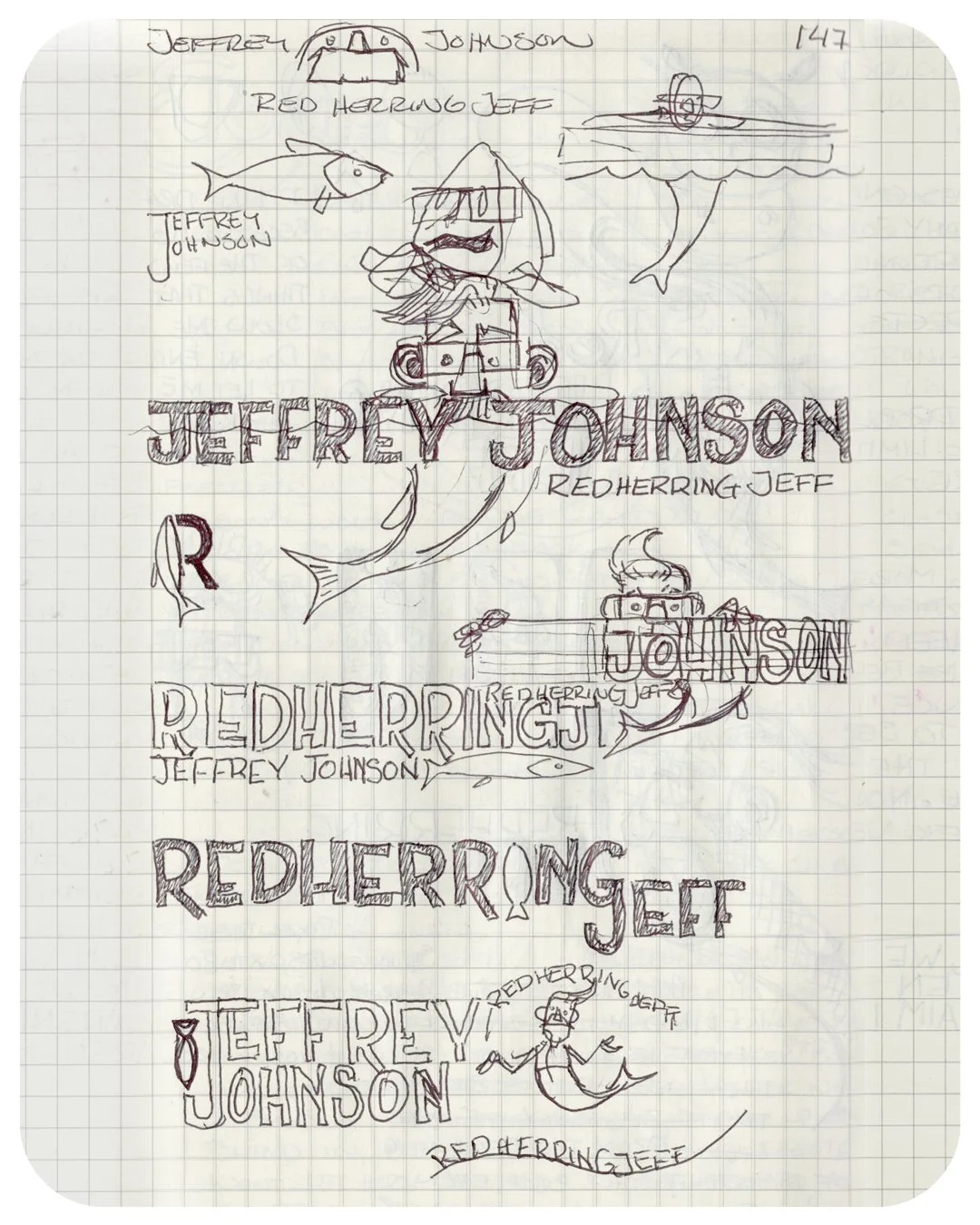
I began by playing with the idea of a traditional merman, using lettering–like a neighbor peeking over the fence–to disguise the transition.
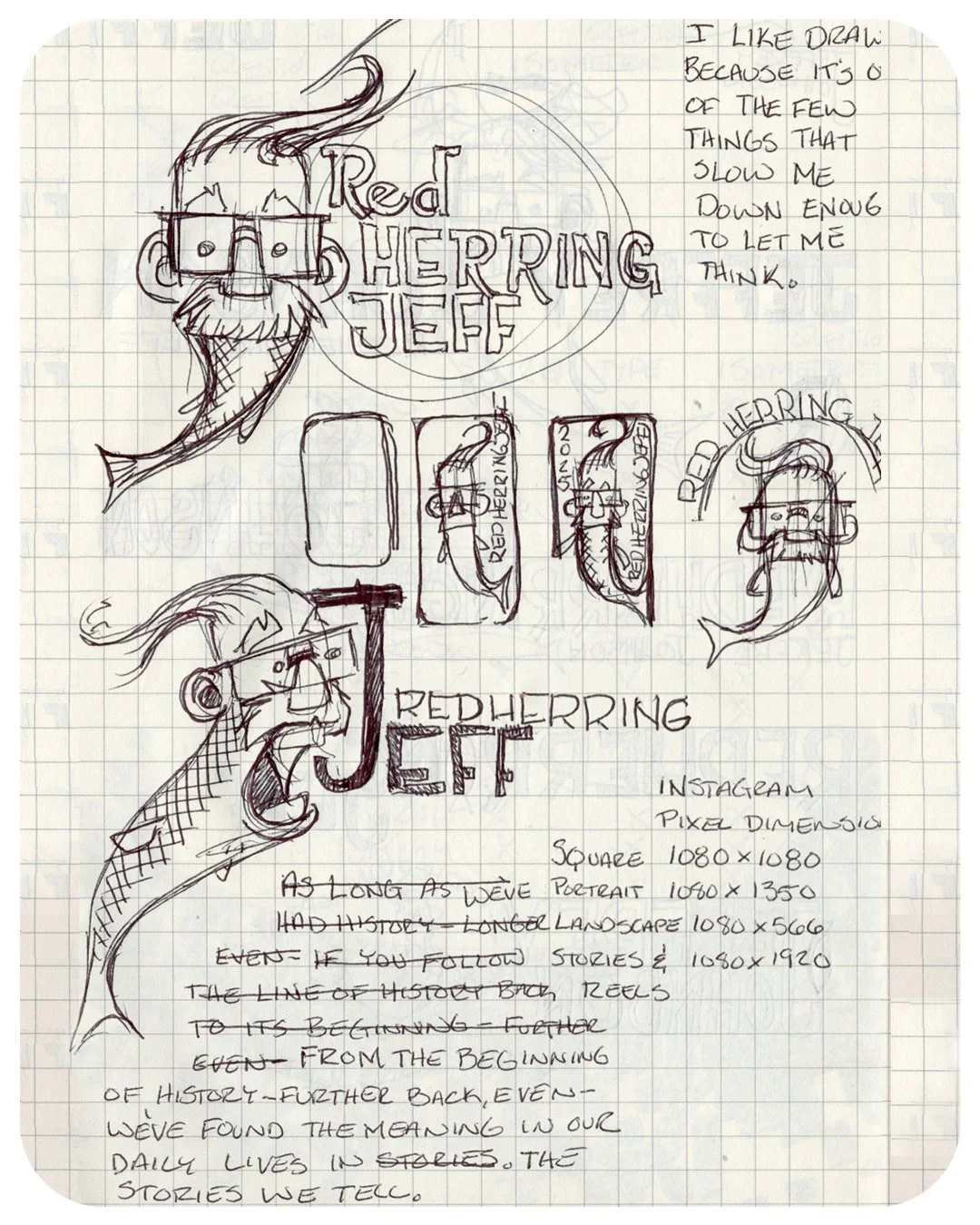
My instructional assistant noted that she liked how the mustache worked as the same type of break that I was going for with the text.
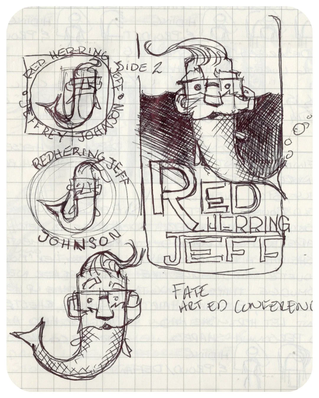
Trying to work it into a circle, tail started bending more and more...
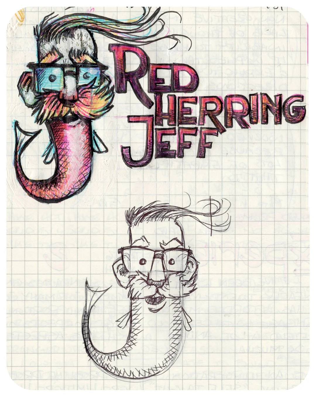
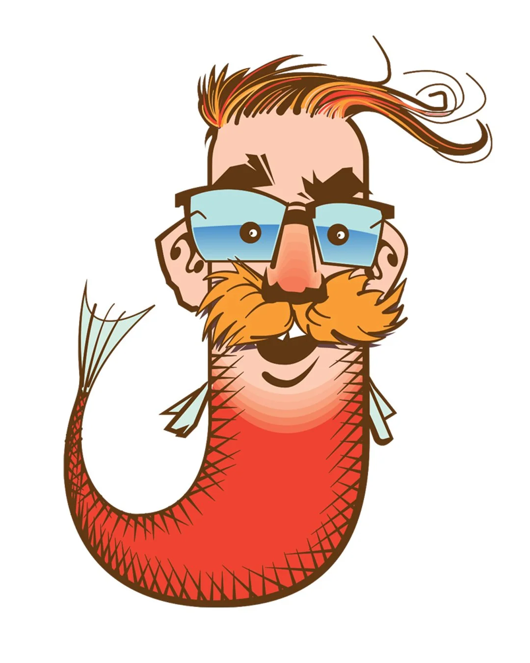
This J silhouette ended up really working for me, so I refined the sketch before importing it into illustrator.
I have some text in the “Murder in the Design Morgue” sketchbook about drawing being the most important first step. I want to expand on that here.
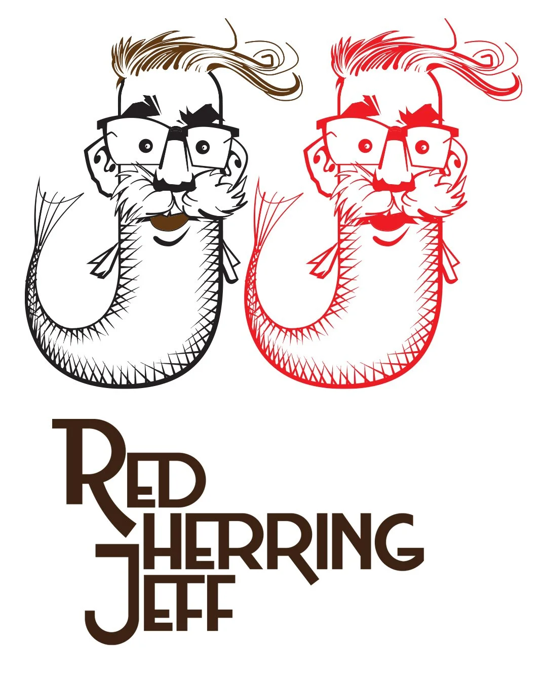
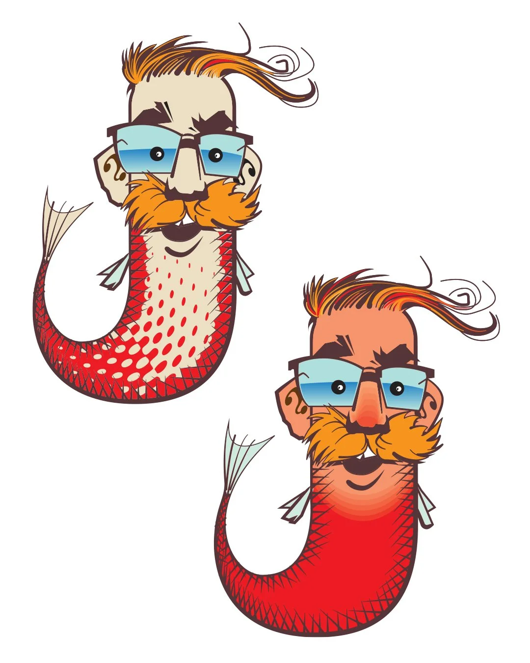
Ooof. That first one was a worthy experiment, but this is why we draw things out on paper first. The second color treatment worked a lot better, but was still a lot oranger than I wanted it to be.
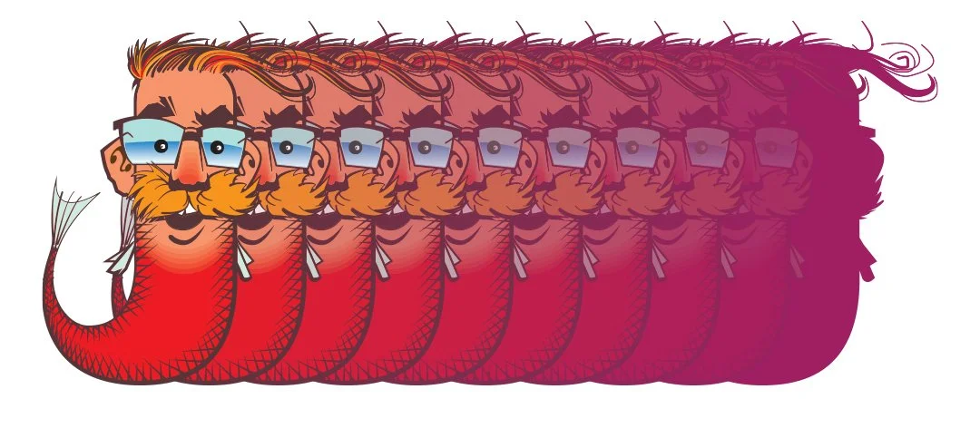
Did you know, you can use the blend command in illustrator to simultaneously try out several color variations?
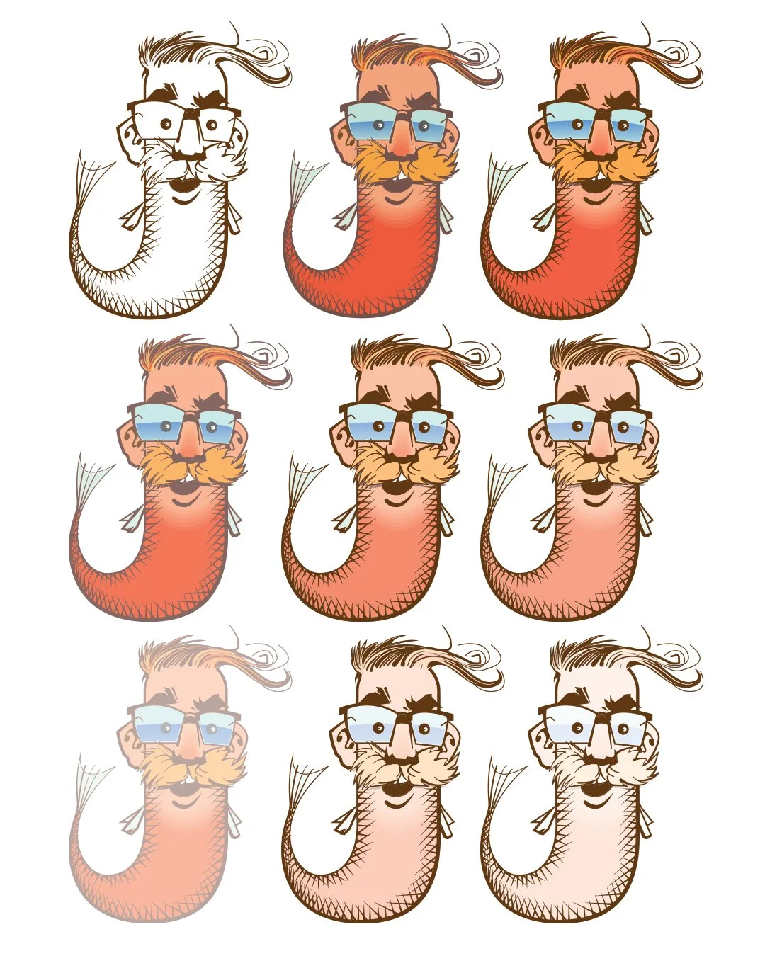
Blending from that dark coral pink to a cream, gave me several options that I could then choose parts from, before laying the original line work back on top of everything to reestablish it's contrast.
Please feel free to email me with comments or to propose corrections (kind and helpful tone appreciated) For news, updates, and pictures of my desk and my dogs, please follow me on Instagram or subscribe for email updates.
Until next time, take care and be good.
Jeffrey